@GivenCui
2017-03-24T12:41:57.000000Z
字数 13255
阅读 1663
所向披靡的响应式开发
响应式 Bootstrap
收获
- Resolution Test (测试chrome响应式插件)
- 用户代理字符串UA
navigator.userAgent (console中测试) - 建议用虚拟机进行IE的测试 虚拟机用Virtual Box ievms
- Xcode(苹果机)上有苹果手机的虚拟机
- 安装虚拟机推荐 genymotion
- 处理兼容性的方法
前期准备
viewport须知
有用的文件
humans.txt
robots.txt
允许爬虫爬取的配置
Use-agent: *Disallow: /admin/
.editorconfig
配置说明
WebStorm直接支持, sublime可安装插件
# editorconfig.orgroot = true[*]charset = utf-8indent_size = 2indent_style = spaceinsert_final_newline = truetrim_trailing_whitespace = true[*.md]trim_trailing_whitespace = false
.gitignore
git的忽略文件
*~.DS_Store.ideanode_modulesdist
CHANGELOG.md
改动说明文件
README.md
项目说明文件
LICENSE.txt
版权等, 参考git上大的项目
html部分
meta标签
<meta charset="utf-8" /><title>xxx</title><meta name="description" content="" /><meta name="keywords" content="" /><meta name="viewport" content="width=device-width, initial-scale=1.0, user-scalable=no, minimum-scale=1.0, maximum-scale=1.0, minimal-ui" /> // minimal-ui IOS系统隐藏操作栏<meta name="HandheldFriendly" content="true"><meta name="MobileOptimized" content="width"><meta name="apple-mobile-web-app-capable" content="yes" /><meta name="apple-mobile-web-app-status-bar-style" content="black" /><meta name="apple-mobile-web-app-title" content="海涛旅游" /><meta name="applicable-device" content="mobile"><meta name="format-detection" content="telephone=no" /><meta name="apple-itunes-app" content="app-id=914881804, app-argument=https://itunes.apple.com/cn/app/hai-tao-lu-you/id914881804?mt=8"><meta name="screen-orientation" content="portrait"><meta name="x5-orientation" content="portrait"><meta name="full-screen" content="yes"><meta name="x5-fullscreen" content="true"><meta name="browsermode" content="application"><meta name="x5-page-mode" content="app"><meta name="msapplication-tap-highlight" content="no">
IE兼容处理
IE8不支持H5标签和媒体查询 (HTML5 elements and media queries)
1.基本写法
<!--[if lt/lte/gt/gte IE 9]> // IE与版本号之间空格lt <lte <=gt >gte >=<![endif]-->
2.用法
<!--[if lt IE9]><div class="browser_upgrade">您的浏览器版本太老, 为了正常使用功能请点击 <a href="http://browsehappy.com">这里</a>更新您的浏览器!!!</div><![endif]-->
3.Boostrap中应用
<!-- HTML5 shim and Respond.js for IE8 support of HTML5 elements and media queries --><!-- WARNING: Respond.js doesn't work if you view the page via file:// --><!--[if lt IE 9]><script src="https://cdn.bootcss.com/html5shiv/3.7.3/html5shiv.min.js"></script><script src="https://cdn.bootcss.com/respond.js/1.4.2/respond.min.js"></script><![endif]-->
H5标签
H5规范中, 大纲outliner中, section和artical最好有标题,nav可以没有标题, 没有标题的section用div替换
<header></header> // 头<footer></footer> // 尾<nav></nav> // 导航, 可以没有标题<article></article> // 最好有h标题,独立完整,有内容,语义更明确, 例如博客中的文章, 帖子<section></section> //最好有h标题,范围广泛, 表示区块, 出现在文档大纲中, 比如广告, 联系方式, 文章中的章节等, 拿不准就用div
id,class命名规范
id 驼峰命名class 用-连接, 更进一步参考 BEM(元素-块-修饰符),见css进阶,js-用于交互
图片引入的选择
<img src="" alt="">1. logo类2. 手机中响应式图片3. 商品展示列表中的图片4. 后台动态添加的图片, 方便切换srcbackground:url();1. 装饰性的
PC端样式
CSS resets vs Normalize.css
推荐用Normalize.css
使用完整Normalize.css, 然后再main.css中覆盖, 方便后期升级
@github
normalize.css 中文版v2.1.2
CSS Normalize文件配置示例
css:1. 让所有标签的样式看起来都一样2. 去除了有用的样式Normalize.css1. 保留有用的默认值,不同于许多 CSS 的重置2. 标准化的样式,适用范围广的元素。3. 纠正错误和常见的浏览器的不一致性。4. 一些细微的改进,提高了易用性。5. 使用详细的注释来解释代码。
打印样式
/* ==============打印样式============== */@media print {*,*:before,*:after {background: transparent !important;color: #000!important;box-shadow: none!important;text-shadow: none!important;}a,a:visited {text-decoration: underline;}a[href]:after {content: "(" attr(href) ")";}abbr[title]:after {content: "(" attr(title) ")";}/**使用#和javascript:;的超链接不打印*/a[href^="#"]:after,a[href^="javascript:"]:after{content:"";}/* 避免内部插入分页符 */pre,blockquote {border:1px solid #999;page-break-inside: avoid; /* Opera浏览器用 */}thead {display: table-header-group;}tr,img {page-break-inside: avoid;}img {max-width: 100%!important;}/* 标题下文字不超过3行, 标题在下一页; 超过3行标题在当前页 */p,h2,h3 {orphans : 3; /* 当元素内部发生分页时, 页面底部保留的最小行数 */widows: 3; /* 当元素内部发生分页时, 页面顶部保留的最小行数 */}/* 禁止在标题后直接插入分页符 */h2,h3 {page-break-after: avoid;}}
main.css
工具样式
/* ==========工具样式 (仿 Boostrap)========== */.center-block {display: block;margin-right: auto;margin-left: auto;}.pull-right {float: right !important;}.pull-left {float: left !important;}.text-right {text-align: right !important;}.hide {display: none !important;}.show {display: block !important;}.invisible {visibility: hidden;}.text-hide {font: 0/0 a; /* a是个最短的字体名字, 客户端上不一定有, 为了符合必须写字体名称 */color: transparent;text-shadow: none;background-color: transparent;border: 0;}
清除浮动与BFC
BFC: (块格式化上下文, 触发BFC即可清除浮动)
能触发BFC的属性:float:*;overflow:hidden/auto;display:table;display:table-cell;display:table-caption;display:inline-block;position:fixed;position:absolute;
推荐的clearfix
/* :before是为了浏览器顶部空白崩溃,防止margin的叠加 */.clearfix:before,.clearfix:after{content:" ";display: table;}.clearfix:after{clear:both;}/* IE6/7 */.clearfix{zoom:1;}
a标签的设置
参照lvha (:link, :visited, :hover, :active)
实际设置 a, a:hover,a:active
a {color: #666;text-decoration: none;}a:hover, a:active {color: #0ae;text-decoration: underline;}
chrome浏览器中文字号12px下限问题
/* 问题: 针对中文line-height:3rem (是36px而不是30px) */html{font-size:62.5%; (10px < 12px, chrome最小支持12px, 所以3rem是36px, 而不是我们想要的30px)}/* 解决 */html{font-size:125%; (20px)}
相邻选择符 E+F用法
/* 选中除第一个之外的li 支持IE7+ */header .top li+li {border-left:1px solid #999;margin-left:-3px;}
移动端样式
媒体查询
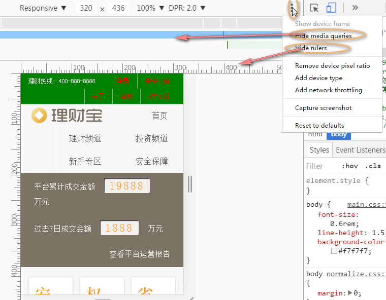
chrome调试工具的使用
1.show media queries和 show rulers
2. 可以直接输入宽度, 也可以↑↓(1px步距)和ctrl+↑↓(10px步距)
设计思路
两种设计理念
渐进增强: 移动端到PC端, 移动优先 (添加元素)
优雅降级: PC端到移动端, 新版浏览器 --> 老浏览器由大到小和由小到大的媒体查询是不一样的
由大到小的方法
方案: 书写在要改变元素的下面/* 最大屏幕的样式 *//* px为断点单位 */@media only screen and (max-width: 800px){/* 中等屏幕 样式 */}@media only screen and (min-width: 481px) and (max-width: 800px){/* Tablet 样式 */}@media only screen and (max-width: 480px){/* mobile 样式 */}/* rem为断点单位,1rem = 16px (浏览器的默认设置) */@media only screen and (max-width: 50rem { /* 800/16px=50rem *//* 中等屏幕 样式 */}@media only screen and (min-width: 30.0625rem) and (max-width: 50rem){/* Tablet 样式 */}@media only screen and (max-width: 30rem){/* mobile 样式 */}
媒体查询断点的单位选择
放缩是对字体的放缩, 相当于改变了html的font-size值
本例采用相对单位作为断点单位
总结: 选择px或em (代替rem)
断点单位可设置px或rem或em1. px根据设备宽度有功能的区分时必须用px,eg: 在pad下没有购买按钮, 在iphone下有购买按钮 (功能)2. rem (同em)媒体查询仅改变样式时, rem能让用户体验变得更好3. em 兼容性更好, 其余同rem, 因为都是相对浏览器的默认字体大小16px;
媒体查询单位为rem的坑 (用em代替)
媒体查询相对不是html的font-size, 而是浏览器的默认字体大小16px;
最终用em代替, 兼容性更好
/* 80rem <==> 80 * 16px = 1280px (不是800px) */@media screen and (max-width: 80rem) {}
css3选择器的总结
兄弟选择器的妙用
/* css */ul li + li {/* 第一个li被排除 */}/* html */<ul><li></li><li></li><li></li><li></li><li></li></ul>
属性选择器
属性值如果符合标准命名可以省略"", 否则不能省略
/* 属性选择器 */E[attr]E[attr="value"]E[attr*="value"] // 包含../* 以下不常用 */E[attr^="value"] // 以..开头E[attr$="value"] // 以..结尾E[attr~="value"] // 包含..,且..是以空格隔开的E[attr|="value"] // 以..为属性 或 ..-开头的---Eg.a[herf^="http://"] /* 双引号不能省 */img[src$=".png"]a[title~="hello"] a[title~="world"] 都可选择 <a title="hello world"></a>div[class|="a"] 选择 <div class="a"> 或 <div class="a-**">
伪类和伪元素
1.常用 :link, :visited, :hover, :active, :focus2.表单 :enabled, :disabled, checked3./* p:nth-child(2) 1. p类型, 第2个索引上的 */:first-child, :last-child:nth-child(even/odd/2n+1/2n), :nth-last-child() /* 表达式值从1开始 *//* p:nth-of-type(2) 1. p类型, 在该类型中的第2个 */:first-of-type, :last-of-type:nth-of-type(), :nth-last-of-type():only-child // 只有1个元素, 且元素类型为指定类型:only-of-type // 可以有多个元素, 但只有一个该类型元素:empty //可以有注释, 不包含文本节点(包括空格)和元素节点 (注释不算文本节点):not():first-line:first-letter:before:after// 在新标准中要求伪元素用::, ::before, ::after// 但是:before和:after在css2.0就实现了// 最终为了兼容性用:before和:after// 其余的伪元素比如::selection必须写::---<div><p></p><h2></h2><p></p> /* 选中 */<p></p><p></p></div>/* 此时下面两种写法等价 */div p:nth-child(3) {}div p:nth-of-type(2) {}
响应式图片
- 图片的排版和布局自适应
- 根据设备的大小加载不同的图片
1. js或服务端 (命令式的实现)
(a) js中设置
原理: 根据window的resize事件改编src的路径
$(function () {function makeImageResponsive() {var width = $(window).width();var img = $('.content img');if (width <= 480) {img.attr('src', 'img/480.png');} else if (width <= 800) {img.attr('src', 'img/800.png');} else {img.attr('src', 'img/1600.png');}}$(window).on('resize load', makeImageResponsive);});/*原生:window.onresize = function(){};window.onload = function(){};*/
(b) 服务器端设置
设备信息写入cookie, 获取图片时在服务器端返回响应图片
2. srcset和sizes (声明式的实现)
MDN
响应式图片srcset全新释义sizes属性w描述符
-> srcset是img的特性, 支持该特性的浏览器会自动根据屏幕宽度改变
-> sizes是阈值的参照, 默认100vw(100% viewport width),而不是父级的尺寸
-> 如果浏览器中缓存过最大尺寸图片, 则任何尺寸下都用该图
-> radio放缩比为2时, 响应断点不是简单的图片宽度/放缩比, 而比该值大,浏览器的内部实现逻辑综合考虑了radio,网速,设备等因素, 所以不用理会
[注意]: srcset有新老两种规范, 新规范中没有w修饰符
<img class="image" src="img/480.png" srcset="img/480.png 480w, img/800.png 800w, img/1600.png 1600w" > <!-- 默认sizes是100vw (100% of viewport width) --><!-- 媒体查询大于800px时, size是800px; 其余时100% --><img class="image" src="img/480.png" srcset="img/480.png 480w, img/800.png 800w, img/1600.png 1600w" sizes="(min-width:800px) 800px, 100vw"><!-- 媒体查询大于800px时, size是cal(100vw - 30px); 其余时100% --><img class="image" src="img/480.png" srcset="img/480.png 480w, img/800.png 800w, img/1600.png 1600w" sizes="(min-width:800px) cal(100vw - 30px), 100vw">
3. picture
如何使用 HTML5 的picture元素处理响应式图片
MDN
<!-- 简单demo --><picture><source srcset="smaller.jpg" media="(max-width: 768px)"><source srcset="default.jpg"><img srcset="default.jpg" alt="My default image"></picture><!-- 复杂demo --><picture><source srcset="smaller_landscape.jpg" media="(max-width: 40em) and (orientation: landscape)"><source srcset="smaller_portrait.jpg" media="(max-width: 40em) and (orientation: portrait)"><source srcset="default_landscape.jpg" media="(min-width: 40em) and (orientation: landscape)"><source srcset="default_portrait.jpg" media="(min-width: 40em) and (orientation: portrait)"><img srcset="default_landscape.jpg" alt="My default image"></picture>
4. svg(支持矢量图)
5. polyfill (浏览器兼容性的"腻子")
技巧总结
inline巧用伪类换行
/* 为了清除浮动, 达到换行的效果 */.product h2 em {display: inline; /* 属性值为inline-block则不换行 */}.product h2 em:first-child:before {content: " ";display: table;}
兼容性的处理方法
Browser hacks
Polyfill或shiv
通过旧浏览器的API来模拟新浏览器功能的兼容库
html5shiv
html5shiv
让IE6-9,Safari 4.x (and iPhone 3.x), and Firefox 3.x.等支持html标签(header,nav,footer,section等)
<!--[if lt IE 9]><script src="bower_components/html5shiv/dist/html5shiv.js"></script><![endif]-->
respond.js (polyfill)
respond
for min/max-width CSS3 Media Queries (for IE 6-8, and more)
/* 仅实现支持一下css3媒体查询功能 */@media screen and (min-width: 480px) and (max-width: 800px) {/** ... **/}
modernizr
- Modernizr
- Modernizr.js入门教程
- It tells you what HTML,CSS and JavaScript features the user's browser has to offer.
- 官网可以定制检测那些属性
- 防御型编程, 主动检测属性的支持
Modernizr帮助我们检测浏览器是否实现了某个feature,如果实现了那么开发人员就可以充分利用这个feature做一些工作,反之没有实现开发人员也好提供一个fallback。所以,我们要明白的是Modernizr只是帮我们检测feature是否被支持,它并不能够给浏览器添加那些本来不支持的feature。
CSS方面
当我们引入了Modernizr.js类库后,
<html>标签的class属性就会被相应的赋值,以显示浏览器是否支持某类CSS属性。以SVG举例 : 如果浏览器不支持SVG特性,那么在<html>标签中就会出现 no-svg 类,我们可以做一些fallback的工作;如果支持,则生成svg类。
.svg .logo{bgackground-image:url(img/logo.svg);}.no-svg .logo{bgackground-image:url(img/logo.png); /* fallback */}
JS方面
详见官方文档
Can I use
后期工作
BrowserSync多设备调试
命令行中
npm install browser-sync -g全局安装browser-sync start --server "src" --files "src"
gulp中
npm用yarn代替
npm install -g yarn
http-server
node.js的包
github
打包发布
压缩,合并,增加版本号
打包工具
- grunt 自动化构建工具
- gulp 自动化构建工具
- Webpack 静态资源打包工具
gulp
安装包和依赖
yarn init/* yarn不用安装全局gulp */yarn add gulp --dev/-D // <=> npm install gulp --save-devyarn add gulp-rev gulp-rev-replace gulp-useref gulp-filter gulp-uglify gulp-csso -Dcd.>gulpfile.js // 创建空gulpfile.js
gulpfile.js
/* gulpfile.js */var gulp = require('gulp');var rev = require('gulp-rev'); // 改变哈希码更新版本, 解决客户端浏览器缓存问题而引用旧文件(index.html排除)var revReplace = require('gulp-rev-replace'); // 更新html中的引用var useref = require('gulp-useref'); // html写注释来配置css,js的合并var filter = require('gulp-filter'); // 过滤器: 1.筛选 2.恢复var uglify = require('gulp-uglify'); // 压缩js插件var csso = require('gulp-csso'); // 压缩css插件gulp.task('default', function () {var jsFilter = filter('**/*.js',{restore: true});var cssFilter = filter('**/*.css',{restore:true});var indexHtmlFilter = filter(['**/*','!**/index.html'],{restore:true});/*流程:gulp.src('src/index.html')--useref()--> 分析html中的注释选出要合并的css,js--jsFilter--> 过滤出js--uglify()--> 压缩js--jsFilter.restore--> 恢复js--cssFilter--> 过滤出css--csso()--> 压缩css--cssFilter.restore--> 恢复css--indexHtmlFilter--> 排除index.html--rev()--> css,js哈希码重命名--indexHtmlFilter.restore--> 恢复index.html--revReplace()--> 更新html引用链接--gulp.dest()--> 输出*/return gulp.src('src/index.html').pipe(useref()).pipe(jsFilter).pipe(uglify()).pipe(jsFilter.restore).pipe(cssFilter).pipe(csso()).pipe(cssFilter.restore).pipe(indexHtmlFilter).pipe(rev()).pipe(indexHtmlFilter.restore).pipe(revReplace()).pipe(gulp.dest('dist'));});
gulp插件说明
gulp-useref
合并css,js文件
<html><head><!-- build:css css/combined.css --><link href="css/one.css" rel="stylesheet"><link href="css/two.css" rel="stylesheet"><!-- endbuild --></head><body><!-- build:js scripts/combined.js --><script type="text/javascript" src="scripts/one.js"></script><script type="text/javascript" src="scripts/two.js"></script><!-- endbuild --></body></html>
压缩
gulp-uglify, gulp-csso
/*! ....*/ 这种注释不会被压缩, 其余注释都会移除
哈希字符串版本号
gulp-rev
原理: 根据文件内容通过算法计算出哈希值, 相同内容文件对应同一个哈希值 (牛逼!)
验证: 改动一处编译, 再改回来编译
tips: 老版本文件应保留一段时间再删除, 防止有正在访问网站的用户体验不好
webpack
webpack更适合模块化开发(require.js/sea.js等),有时webpack和gulp结合使用
详细内容见webpack教程
流行的响应式框架
优点: 适合个人/创业团队, 稳定
缺点: 体积大,而重; 不好修改; 样式类似, 不灵活
适用场景: 后端管理系统; demo; 快速第一版搭建
Bootstrap
Foundation
文档很详细
Semantic UI
语义化,自然语法的方式
样式很漂亮,更丰富
<div class="ui three buttons"><button class="ui active button">第一个</button><button class="ui button">第二个</button><button class="ui button">第三个</button></div>
PureCSS
产品经理和原型设计
- 纸和笔
- axure RP 和 axure RP中文网 (收费)(快)
- Sketch (苹果) (原型/UI/矢量图)
