@adonia
2016-11-22T16:26:36.000000Z
字数 6760
阅读 274
angular2(6): 内置组件
angular2
在之前的示例中,为了遍历产品列表,使用了*ngFor组件。像*ngFor这种的组件,在使用时,并没有声明引用(即在使用的组件的directives中声明组件的定义类),这种组件称为内部组件(build-in component)。类似*ngFor的组件,在angular2还有一些,下面就来一一介绍。
说明:工程的搭建方法可以参照之前的示例,这里不再赘述。参考示例代码。
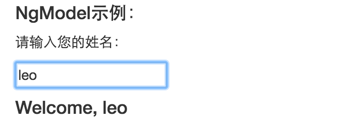
NgModel
接触过angular1的,应该都直到其中有一个特别重要的特性---数据绑定(data binding)。在诸如input,radio等组件中,通过ng-model可以将组件的值与$scope中的一个属性进行绑定,这样,在组件的值或者属性的值发生变化时,能够实时同步到对端。
在angular2中,也有同样功能的组件---NgModel,先看个示例:
@Component({selector: 'ng-model',template: `<p>请输入您的姓名:</p><input type="text" [(ngModel)]="name" placeholder="请输入您的姓名"><h4 *ngIf="name">Welcome, {{name}}</h4>`})class NgModelComponent {}
例子中,使用了NgModel将属性name绑定到input上。这样,在input输入框的内容发生变化时,就会将内容实时同步至name中。
⚠️注意:
NgModel的语法格式为:[(ngModel)]="属性名",不能省去圆括号();使用了
NgModel组件,在NgModelComponent类中,不需要声明name属性,甚至不用建立构造方法。在NgModel解析时,会自动创建,并在两者间建立好监听。所以,Welcome, {{name}}中直接使用了name属性。这里使用了
NgIf组件,待会会介绍。
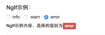
NgIf
NgIf主要用于控制DOM元素的展示或者隐藏的,而这是通过传入NgIf组件的表达式的值所决定的。当表达式的值为true,或者不为空时(即逻辑上为真),展示DOM元素;否则不展示。
例如上述示例中的:<h4 *ngIf="name">Welcome, {{name}}</h4>,在input输入框为空时,即未输入任何内容,这时文本信息是隐藏的。在输入内容之后,文本信息就会展示出来。
NgIf的语法格式为: *ngInf="表达式"。例如:
<div *ngIf="false"></div> <!-- 内容永远隐藏 --><div *ngIf="a > b"></div> <!-- 当a大于b时,内容显示 --><div *ngIf="str == 'yes'"></div> <!-- 当str字符串的值为yes时,内容展示 --><div *ngIf="myFunc()"></div> <!-- 当方法返回`真`时,显示 -->
看个具体的例子:
@Component({selector: 'ng-if',template: `<!-- 当前angular2版本暂不支持在radio中使用NgModel,只能使用output代替 --><label class="radio-inline"><input type="radio" name="levelradio" (click)="levelValue = 0">info</label><label class="radio-inline"><input type="radio" name="levelradio" (click)="levelValue = 1">warn</label><label class="radio-inline"><input type="radio" name="levelradio" (click)="levelValue = 2">error</label><h5 *ngIf="levelValue == 0">NgIf示例内容,选择的级别为<span class="label label-info">Info</span></h5><h5 *ngIf="levelValue == 1">NgIf示例内容,选择的级别为<span class="label label-warning">warn</span></h5><h5 *ngIf="levelValue == 2">NgIf示例内容,选择的级别为<span class="label label-danger">error</span></h5>`})class NgIfComponent {}
例子中,通过选择不同的radio框,来展示不同的内容。注意,当前版本的angular2,不支持在radio中使用NgModel,所以这里是通过click事件来设值。
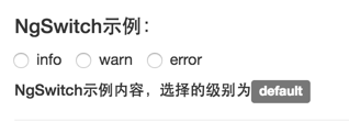
NgSwitch
NgSwitch的作用与NgIf类似,只是在选择场景不较多的情况下,使用NgIf会显得很繁琐。在像JAVA等语言中,也有类似switch...case...的语法。
将上述NgIf的例子,使用NgSwitch实现:
@Component({selector: 'ng-switch',template: `<label class="radio-inline"><input type="radio" name="levelradio" (click)="levelValue1 = 0">info</label><label class="radio-inline"><input type="radio" name="levelradio" (click)="levelValue1 = 1">warn</label><label class="radio-inline"><input type="radio" name="levelradio" (click)="levelValue1 = 2">error</label><div [ngSwitch]="levelValue1"><h5 *ngSwitchWhen="0">NgSwitch示例内容,选择的级别为<span class="label label-info">Info</span></h5><h5 *ngSwitchWhen="1">NgSwitch示例内容,选择的级别为<span class="label label-warning">warn</span></h5><h5 *ngSwitchWhen="2">NgSwitch示例内容,选择的级别为<span class="label label-danger">error</span></h5><h5 *ngSwitchDefault>NgSwitch示例内容,选择的级别为<span class="label label-default">default</span></h5></div>`})class NgSwitchComponent {}
NgSwitch的语法是:[ngSwitch]="目标表达式",紧跟着是一个或者多个*ngSwitchWhen="预期值"。而NgSwitch与NgIf不同的是,前者提供了一个可选的默认选项---*ngSwitchDefault来指定当所有的预期值都不符合的情况下,该做出的选择。注意喔,*ngSwitchDefault是可选的,如果没有,当所有的预期值都不匹配时,意味着不做任何选择。
NgStyle
NgStyle组件,提供了一种使用angular2中的表达式来设置DOM的CSS属性。也就是说,我们可以通过程序的具体场景逻辑来动态控制DOM的展示样式。
NgStyle组件提供了两种语法格式:
[style.CSS样式名]="CSS样式值",例如:
<div [style.background-color]="'yellow'"><p>This is a fixed area with yellow background.</p></div>
[ngStyle]="CSS样式对象",例如:
<div [ngStyle]="{color: 'white', 'background-color': 'blue'}">This is a fixed white text on blue background.</div>
注意,第二种方式接收的是JavaScript对象,那么,形如
background-color这种带有-的字符串,就需要使用引号扩起来,否则是无法作为key的。
来看个具体的例子:
@Component({selector: 'ng-style',template: `<div *ngIf="colorInput.value" [style.color]="color" [style.font-size.px]="fontInput.value" [ngStyle]="{'margin': '10px 0px', 'border': '1px solid'}">{{text}}</div><form class="form-horizontal"><div class="form-group"><label class="control-label col-sm-2">请输入字体颜色:</label><div class="col-sm-8"><input type="text" class="form-control input-form" #colorInput></div></div><div class="form-group"><label class="control-label col-sm-2">请输入字体大小:</label><div class="col-sm-8"><input type="text" class="form-control input-form" #fontInput></div></div><div class="form-group"><label class="control-label col-sm-2">请输入文字内容:</label><div class="col-sm-8"><input type="text" class="form-control" #textInput></div></div><div class="form-group"><div class="col-sm-offset-2"><button class="btn btn-info" (click)="apply(colorInput.value, fontInput.value, textInput.value)">提交</button></div></div></form>`})class NgStyleComponent {color: string;fontSize: number;text: string;constructor() {this.color = 'pink';this.fontSize = 15;}apply(color, fontSize, text): void {this.color = color;this.fontSize = fontSize;this.text = text ? text : color + ' text';}}
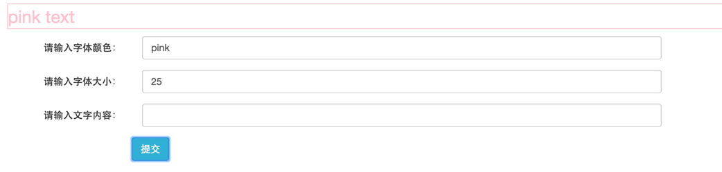
示例中,通过输入字体的颜色和大小,来动态调整文本的展示效果。
注意:
[style.font-size.px]="fontInput.value"中,通过[style.CSS属性名.单位]="属性值"的方式,来指明了一些需要设置单位的CSS样式。另外,这里的fontInput对应的是Input组件,类型是HTMLInputElement,声明的方式如:<input type="text" class="form-control input-form" #fontInput>。通过fontInput.value即可获取输入框中的值。
[style.color]="color"中,引用了类NgStyleComponent中的color属性的值。注意,这里并不是{{color}}的格式,不能与在DOM中展示内容的格式混淆了。
NgClass
NgClass提供了动态设置或者修改DOM中的CSS类的能力。例如:
@Component({selector: 'ng-class',template: `<div [ngClass]="{bordered: isBordered}" (click)="toggleBorder()"><p>点击文字区域,设置/取消边框。</p></div><div [ngClass]="['bordered', 'blue-text']"><p>带有边框的绿色文字区域。</p></div><div [ngClass]="classList"><p>带有边框的粉红色背景字体区域。</p></div>`})class NgClassComponent {isBordered: boolean;classList: Array<string>;constructor() {this.classList = ['bordered', 'pink-background'];}toggleBorder(): void {this.isBordered = ! this.isBordered;}}
首先,定义bordered等样式:
.bordered {border: 1px dashed black;background-color: #eee;}.blue-text {color: blue;}.pink-background {background-color: hotpink;}
在示例中的第一部分:
<div [ngClass]="{bordered: isBordered}" (click)="toggleBorder()"><p>点击文字区域,设置/取消边框。</p></div>
在点击文字区域后,会被设置bordered样式,再次点击,取消样式,如下:

这里,通过[ngClass]="{属性名: 表达式}"的方式来控制样式的设置。如果表达式结果为真,那么DOM元素将设置该CSS样式,否则,则不设置。
示例的第二部分:
<div [ngClass]="['bordered', 'blue-text']"><p>带有边框的绿色文字区域。</p></div>
这里,在ngClass中传入一个数组,意味着,数组中的每一个元素将作为CSS样式类作用到元素上。也可以直接向ngClass传入一个数组变量,如例子中的classList。
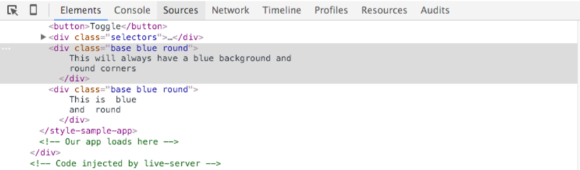
如果,HTML中的class元素,与angular2中的NgClass组件同时出现在DOM元素中,那么,结果是两者将会同时生效。例如:
<div class="base" [ngClass]="['blue', 'round']"> This will always have a blue background and round corners</div>
在angular2解析完成之后,该元素的class属性会是base blue round。
NgFor
在之前的示例中,也有使用到NgFor组件,主要用于遍历数据。语法格式为*ngFor="#item of array",这里呢,表示遍历数组对象array中的每一个元素,并将其赋值给item。还有一种是取遍历的索引的,语法格式为*ngFor="#item of array; #i = index",这里,index是遍历过程中的索引值,从0开始。
注意:获取索引的赋值方式,跟获取元素的赋值方式不一样。不可写成
#i of index这种!
具体用法参考示例代码,不做介绍。
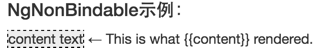
NgNonBindable
我们一直在使用angular2的模板语法---{{property}},那如果想要在模板中展示{{property}}这种字符串怎么办呢?
angular2中提供了一个内置组件---ngNonBindable,就是用来标识指定区域下的内容不被angular2编译。例如:
@Component({selector: 'ng-non-bindable',template:`<div><span class="bordered">{{content}}</span><span class="pre" ngNonBindable>← This is what {{content}} rendered.</span></div>`})class NgNonBindComponent {content: string;constructor() {this.content = 'content text';}}
展示效果如下: