@yzzer
2020-05-05T03:38:47.000000Z
字数 2189
阅读 627
React Native 弹出框 Alert
弹出框 `` 是浮于当前界面之上的,用于阻止用户的下一步操作,直到用户点击了弹出框上的任意按钮为止。
弹出框 `` 一般用于弹出 提示、弹出警告、弹出确认 等需要用户注意和确认的动作。
弹出提示
弹出提示框一般只有一个 确认 按钮,用户点击 确认 就是 我知道了的 意思。
弹出警告
弹出警告框一般有两个按钮 确认 和 取消, 取消 按钮在右边,方便用户点击。
弹出确认
弹出确认框一般有两个按钮 确认 和 取消, 确认 按钮在右边,方便用户点击。
引入组件
import { Alert } from 'react-native'
使用语法
Alert.alert(title, message?, buttons?, options?, type?)
使用范例
// 同时兼容 iOS 和 AndroidAlert.alert('弹出框标题','弹出框描述',[{text: '自定义按钮', onPress: () => console.log('点击了自定义按钮')},{text: '取消',onPress: () => console.log('点击了取消按钮'),style: 'cancel',},{text: '确认', onPress: () => console.log('点击了确认按钮')},],{cancelable: false},);
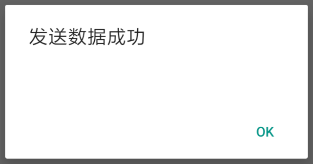
范例 1 : 弹出提示
下面的代码,当我们点击 发送 按钮时会弹出一个提示 操作成功。
Step 1: App.js
import React from 'react'import { Alert, Text, TouchableOpacity, StyleSheet } from 'react-native'const App = () => {const showAlert = () =>{Alert.alert('发送数据成功')}return (<TouchableOpacity onPress = {showAlert} style = {styles.button}><Text>发送</Text></TouchableOpacity>)}export default Appconst styles = StyleSheet.create ({button: {backgroundColor: '#4ba37b',width: 100,borderRadius: 50,alignItems: 'center',marginTop: 100}})
演示效果如下
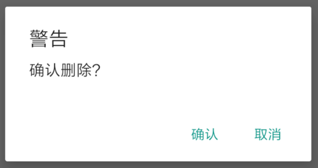
范例 2: 弹出警告
下面的代码,当我们点击 删除 按钮时会弹出一个警告 是否删除。
如果用户点击了 取消 则什么事情都不做,如果点击了 确认 则会删除数据然后弹出提示
Step 1: App.js
import React from 'react'import { Alert, Text, TouchableOpacity, StyleSheet } from 'react-native'const App = () => {const showTip = () => {Alert.alert('删除数据成功')}const showAlert = () =>{Alert.alert('警告','确认删除?',[{text: '确认', onPress: () => showTip()},{text: '取消', style: 'cancel'},],{cancelable: false})}return (<TouchableOpacity onPress = {showAlert} style = {styles.button}><Text>删除</Text></TouchableOpacity>)}export default Appconst styles = StyleSheet.create ({button: {backgroundColor: '#4ba37b',width: 100,borderRadius: 50,alignItems: 'center',marginTop: 100}})
演示效果如下
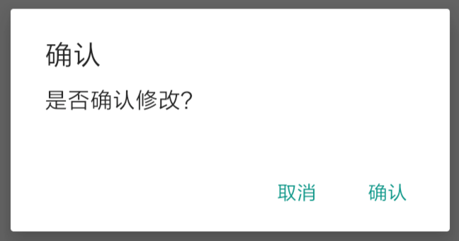
范例 3: 弹出确认
下面的代码,当我们点击 修改 按钮时会弹出一个确认框 是否确认。
如果用户点击了 取消 则什么事情都不做,如果点击了 确认 则会修改数据然后弹出提示
Step 1: App.js
import React from 'react'import { Alert, Text, TouchableOpacity, StyleSheet } from 'react-native'const App = () => {const showTip = () => {Alert.alert('修改数据成功')}const showAlert = () =>{Alert.alert('确认','是否确认修改?',[{text: '取消', style: 'cancel'},{text: '确认', onPress: () => showTip()},],{cancelable: false})}return (<TouchableOpacity onPress = {showAlert} style = {styles.button}><Text>修改</Text></TouchableOpacity>)}export default Appconst styles = StyleSheet.create ({button: {backgroundColor: '#4ba37b',width: 100,borderRadius: 50,alignItems: 'center',marginTop: 100}})
演示效果如下
