@KarlYan95
2017-07-25T13:35:30.000000Z
字数 15029
阅读 858
Matplotlib: plotting 《Scipy Lecture Notes》
Python
matplotlib.org
Matplotlib: plotting
1 简介 Introduction
Matplotlib is probably the single most used Python package for
2D-graphics. It provides both a very quick way to visualize data from
Python and publication-quality figures in many formats. We are going
to explore matplotlib in interactive mode covering most common cases.
Matplotlib可能是2D图形中最常用的Python包。它提供了一个非常快速的方式来显示来自Python的数据和许多格式的数据。我们将以互动模式探索matplotlib,涵盖大多数常见的情况。
1.1 IPython与Matplotlib模式
IPython is an enhanced interactive Python shell that has lots of
interesting features including named inputs and outputs, access to
shell commands, improved debugging and many more. It is central to the
scientific-computing workflow in Python for its use in combination
with Matplotlib: For interactive matplotlib sessions with
Matlab/Mathematica-like functionality, we use IPython with it’s
special Matplotlib mode that enables non-blocking plotting.
IPython是一个增强的交互式Python外壳,具有许多有趣的功能,包括命名输入和输出,访问shell命令,改进的调试等等。它是Python中科学计算工作流的核心,它与Matplotlib结合使用:对于使用Matlab/Mathematica类功能的交互式matplotlib会话,我们使用IPython与特殊的Matplotlib模式,可以实现非阻塞绘图。
1.2 pyplot
pyplot provides a procedural interface to the matplotlib
object-oriented plotting library. It is modeled closely after Matlab™.
Therefore, the majority of plotting commands in pyplot have Matlab™
analogs with similar arguments. Important commands are explained with
interactive examples.
pyplot为matplotlib面向对象的绘图库提供了一个程序接口。它与Matlab™类似。因此,pyplot中的大多数绘图命令具有类似参数的Matlab™类似物。重要的命令用交互式示例进行说明。
习惯用法 from matplotlib import pyplot as plt
2 简单画图 Simple plot
In this section, we want to draw the cosine and sine functions on the
same plot. Starting from the default settings, we’ll enrich the figure
step by step to make it nicer.
在本节中,我们要在同一个图上画出余弦和正弦函数。从默认设置开始,我们将逐步丰富图形,使其更好。
- 第一步
import numpy as npX = np.linspace(-np.pi, np.pi, 256, endpoint=True)C, S = np.cos(X), np.sin(X)
2.1 用默认设置画图 Plotting with default settings
Matplotlib comes with a set of default settings that allow customizing
all kinds of properties. You can control the defaults of almost every
property in matplotlib: figure size and dpi, line width, color and
style, axes, axis and grid properties, text and font properties and so
on.
Matplotlib带有一组允许自定义各种属性的默认设置。你可以控制matplotlib中几乎每个属性的默认值:图形尺寸和dpi,线宽,颜色和样式,轴,轴和网格属性,文本和字体属性等。
参考文档:
plot toturial
plot command
import numpy as npimport matplotlib.pyplot as pltX = np.linspace(-np.pi, np.pi, 256, endpoint=True)C, S = np.cos(X), np.sin(X)plt.plot(X, C)plt.plot(X, S)plt.show()

2.2 初始化默认设置 Instantiating defaults
直接上代码
import numpy as npimport matplotlib.pyplot as plt# Create a figure of size 8x6 inches, 80 dots per inchplt.figure(figsize=(8, 6), dpi=80)# Create a new subplot from a grid of 1x1# plt.subplot(rows, columns, position)plt.subplot(1, 1, 1)X = np.linspace(-np.pi, np.pi, 256, endpoint=True)C, S = np.cos(X), np.sin(X)# Plot cosine with a blue continuous line of width 1 (pixels)plt.plot(X, C, color="blue", linewidth=1.0, linestyle=":")# Plot sine with a green continuous line of width 1 (pixels)plt.plot(X, S, color="green", linewidth=1.0, linestyle="-")# Set x limitsplt.xlim(-4.0, 4.0)# Set x ticksplt.xticks(np.linspace(-4, 4, 9, endpoint=True))# Set y limitsplt.ylim(-1.0, 1.0)# Set y ticksplt.yticks(np.linspace(-1, 1, 5, endpoint=True))# Save figure using 72 dots per inch# plt.savefig("exercice_2.png", dpi=72)# Show result on screenplt.show()
2.3 改变颜色与线的宽度 Changing colors and line widths
plt.figure(figsize=(10, 6), dpi=80)plt.plot(X, C, color="blue", linewidth=2.5, linestyle="-")plt.plot(X, S, color="red", linewidth=2.5, linestyle="-")
2.4 limits的设置 Setting limits
Current limits of the figure are a bit too tight and we want to make
some space in order to clearly see all data points.
plt.xlim(X.min() * 1.1, X.max() * 1.1)plt.ylim(C.min() * 1.1, C.max() * 1.1)
2.5 Tick的设置 Setting ticks
plt.xticks([-np.pi, -np.pi/2, 0, np.pi/2, np.pi])plt.yticks([-1, 0, +1])

2.6 Tick标签设置 Setting tick labels
Ticks are now properly placed but their label is not very explicit. We
could guess that 3.142 is π but it would be better to make it
explicit. When we set tick values, we can also provide a corresponding
label in the second argument list. Note that we’ll use latex to allow
for nice rendering of the label.
ticks现在已妥善设置,但标签不太明确。我们可以猜到3.142是π,但最好是明确表示。当我们设置tick值时,我们还可以在第二个参数列表中提供相应的标签。
注意,我们将使用latex来允许标签的漂亮渲染。
plt.xticks([-np.pi, -np.pi/2, 0, np.pi/2, np.pi],[r'$-\pi$', r'$-\pi/2$', r'$0$', r'$+\pi/2$', r'$+\pi$'])plt.yticks([-1, 0, +1],[r'$-1$', r'$0$', r'$+1$'])

2.7 Moving spines
Spines are the lines connecting the axis tick marks and noting the
boundaries of the data area. They can be placed at arbitrary positions
and until now, they were on the border of the axis. We’ll change that
since we want to have them in the middle. Since there are four of them
(top/bottom/left/right), we’ll discard the top and right by setting
their color to none and we’ll move the bottom and left ones to
coordinate 0 in data space coordinates.
Spines是连接轴刻度线并区分数据区域边界的线。它们可以放置在任意位置,在此之前,它们都在轴的边界上。现在,我们将它们移到重点来。
由于有四个Spines(上/下/左/右),通过将其颜色设置为none来丢弃顶部和右侧,将在底部和左侧移动到数据空间坐标中的坐标0。
ax = plt.gca() # gca stands for 'get current axis'ax.spines['right'].set_color('none')ax.spines['top'].set_color('none')ax.xaxis.set_ticks_position('bottom')ax.spines['bottom'].set_position(('data',0))ax.yaxis.set_ticks_position('left')ax.spines['left'].set_position(('data',0))

2.8 Adding a legend
plt.plot(X, C, color="blue", linewidth=2.5, linestyle="-", label="cosine")plt.plot(X, S, color="red", linewidth=2.5, linestyle="-", label="sine")plt.legend(loc='upper left')

2.9 注释一些点 Annotate some points
Let’s annotate some interesting points using the annotate command. We
chose the 2π/3 value and we want to annotate both the sine and the
cosine. We’ll first draw a marker on the curve as well as a straight
dotted line. Then, we’ll use the annotate command to display some text
with an arrow. 我们使用annotate命令来注释一些有趣的点。我们选择了2π/3值,同时注释正弦和余弦函数。
首先,在曲线上绘制一个标记,同时画一条虚线。然后,我们将使用annotate命令显示一些带箭头的文本。
t = 2 * np.pi / 3plt.plot([t, t], [0, np.cos(t)], color='blue', linewidth=2.5, linestyle="--")plt.scatter([t, ], [np.cos(t), ], 50, color='blue')plt.annotate(r'$cos(\frac{2\pi}{3})=-\frac{1}{2}$',xy=(t, np.cos(t)), xycoords='data',xytext=(-90, -50), textcoords='offset points', fontsize=16,arrowprops=dict(arrowstyle="->", connectionstyle="arc3,rad=.2"))plt.plot([t, t],[0, np.sin(t)], color='red', linewidth=2.5, linestyle="--")plt.scatter([t, ],[np.sin(t), ], 50, color='red')plt.annotate(r'$sin(\frac{2\pi}{3})=\frac{\sqrt{3}}{2}$',xy=(t, np.sin(t)), xycoords='data',xytext=(+10, +30), textcoords='offset points', fontsize=16,arrowprops=dict(arrowstyle="->", connectionstyle="arc3,rad=.2"))

2.10 需要注意的一些细节 Devil is in the details
The tick labels are now hardly visible because of the blue and red
lines. We can make them bigger and we can also adjust their properties
such that they’ll be rendered on a semi-transparent white background.
This will allow us to see both the data and the labels.
由于蓝色和红色线条,刻度标签现在几乎不可见。我们可以让它们更大,我们也可以调整他们的属性,使它们呈现在半透明的白色背景上。这将使我们能够看到数据和标签。
for label in ax.get_xticklabels() + ax.get_yticklabels():label.set_fontsize(16)label.set_bbox(dict(facecolor='white', edgecolor='None', alpha=0.65))

3 Figures, Subplots, Axes and Ticks
A figure in matplotlib means the whole window in the user
interface. Within this figure there can be subplots.figure是matplotlib呈现在用户面前的整个窗口。figure内的图称为subplots
So far we have used implicit figure and axes creation. This is handy
for fast plots. We can have more control over the display using
figure, subplot, and axes explicitly. While subplot positions the
plots in a regular grid, axes allows free placement within the figure.
Both can be useful depending on your intention. We’ve already worked
with figures and subplots without explicitly calling them. When we
call plot, matplotlib calls gca() to get the current axes and gca in
turn calls gcf() to get the current figure. If there is none it calls
figure() to make one, strictly speaking, to make a subplot(111). Let’s
look at the details.
到目前为止,我们已经使用了隐式图形和轴创建。这对于快速画图很方便。我们可以使用figure,subplots和axes来显式得、更好地控制显示。虽然subplot将图形定位在规则网格中,但axes可以在图中自由放置。两者都可以根据使用者的意愿来放置。
我们已经之前已经接触了figure和subplot,但却没有明确的如此称呼。
当我们调用plot时,matplotlib调用gca()来获取当前axes,gca依次调用gcf()来获取当前figure。
如果没有,那么调用figure()来做一个subplot(111)。让我们来看看细节。
3.1 大图 Figure
| Argument | Default | Description |
|---|---|---|
| num | 1 | number of figure |
| figsize | figure.figsize | figure size in inches (width, height) |
| dpi | figure.dpi | resolution in dots per inch |
| facecolor | figure.facecolor | color of the drawing background |
| edgecolor | figure.edgecolor | color of edge around the drawing background |
| frameon | True | draw figure frame or not |
3.2 子图 subplots
With subplot you can arrange plots in a regular grid. You need to
specify the number of rows and columns and the number of the plot.
Note that the gridspec command is a more powerful alternative.
通过subplot,您可以在普通网格中任意放置图。您需要指定行数和列数以及绘图位置。gridspec命令是一个更强大的替代方案。
3.3 坐标轴 Axes
Axes are very similar to subplots but allow placement of plots at any
location in the figure. So if we want to put a smaller plot inside a
bigger one we do so with axes.
axes非常类似于subplot,但允许将之放置在Figure中的任何位置。所以如果我们想把一个较小的plot放在一个更大的地方,axes也能进行类似的操作。
3.4 刻度 Ticks
Well formatted ticks are an important part of publishing-ready
figures. Matplotlib provides a totally configurable system for ticks.
There are tick locators to specify where ticks should appear and tick
formatters to give ticks the appearance you want. Major and minor
ticks can be located and formatted independently from each other. Per
default minor ticks are not shown, i.e. there is only an empty list
for them because it is as NullLocator (see below).
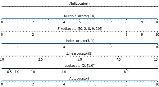
精确的刻度是出版物的重要组成部分。Matplotlib提供了一个完全可配置ticks的系统。有一些tick定位器可以指定tick应该出现在哪里,并且可以定制ticks的外观。主要和次要刻度可以彼此独立地定位和格式化。每个默认ticks镜像都不会显示,即只有一个空列表,因为它是NullLocator(见下文)。
3.4.1 Tick Locators
Tick locators control the positions of the ticks. They are set as follows:
ax = plt.gca()ax.xaxis.set_major_locator(eval(locator))
There are several locators for different kind of requirements:
4 其它类型的图 Other Types of Plots
4.1 规则画图 Regular Plots
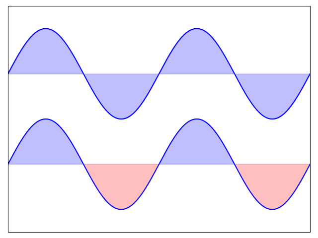
import numpy as npimport matplotlib.pyplot as pltn = 256X = np.linspace(-np.pi, np.pi, n, endpoint=True)Y = np.sin(2 * X)plt.axes([0.025, 0.025, 0.95, 0.95])plt.plot(X, Y + 1, color='blue', alpha=1.00)plt.fill_between(X, 1, Y + 1, color='blue', alpha=.25)plt.plot(X, Y - 1, color='blue', alpha=1.00)plt.fill_between(X, -1, Y - 1, (Y - 1) > -1, color='blue', alpha=.25)plt.fill_between(X, -1, Y - 1, (Y - 1) < -1, color='red', alpha=.25)plt.xlim(-np.pi, np.pi)plt.xticks(())plt.ylim(-2.5, 2.5)plt.yticks(())plt.show()
4.2 散点图 Scatter Plots
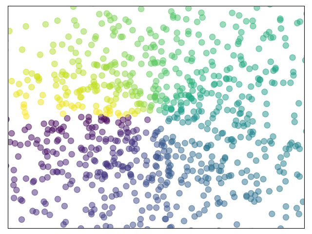
import numpy as npimport matplotlib.pyplot as pltn = 1024X = np.random.normal(0, 1, n)Y = np.random.normal(0, 1, n)T = np.arctan2(Y, X)plt.axes([0.025, 0.025, 0.95, 0.95])plt.scatter(X, Y, s=75, c=T, alpha=.5)plt.xlim(-1.5, 1.5)plt.xticks(())plt.ylim(-1.5, 1.5)plt.yticks(())plt.show()
4.3 条形图 Bar Plots
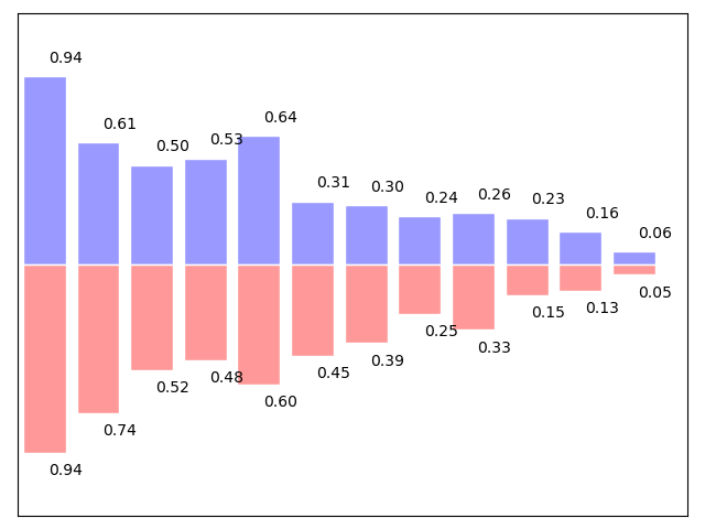
import numpy as npimport matplotlib.pyplot as pltn = 12X = np.arange(n)Y1 = (1 - X / float(n)) * np.random.uniform(0.5, 1.0, n)Y2 = (1 - X / float(n)) * np.random.uniform(0.5, 1.0, n)plt.axes([0.025, 0.025, 0.95, 0.95])plt.bar(X, +Y1, facecolor='#9999ff', edgecolor='white')plt.bar(X, -Y2, facecolor='#ff9999', edgecolor='white')for x, y in zip(X, Y1):plt.text(x + 0.4, y + 0.05, '%.2f' % y, ha='center', va= 'bottom')for x, y in zip(X, Y2):plt.text(x + 0.4, -y - 0.05, '%.2f' % y, ha='center', va= 'top')plt.xlim(-.5, n)plt.xticks(())plt.ylim(-1.25, 1.25)plt.yticks(())plt.show()
4.4 等高线图 Contour Plots
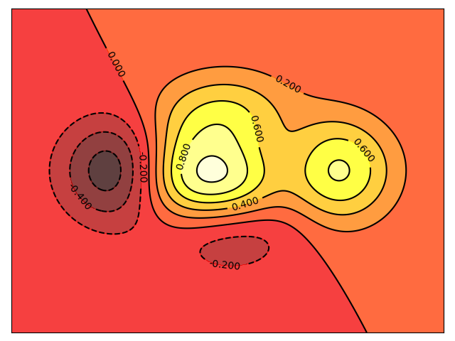
import numpy as npimport matplotlib.pyplot as pltdef f(x,y):return (1 - x / 2 + x**5 + y**3) * np.exp(-x**2 -y**2)n = 256x = np.linspace(-3, 3, n)y = np.linspace(-3, 3, n)X,Y = np.meshgrid(x, y)plt.axes([0.025, 0.025, 0.95, 0.95])plt.contourf(X, Y, f(X, Y), 8, alpha=.75, cmap=plt.cm.hot)C = plt.contour(X, Y, f(X, Y), 8, colors='black', linewidth=.5)plt.clabel(C, inline=1, fontsize=10)plt.xticks(())plt.yticks(())plt.show()
4.5 Imshow
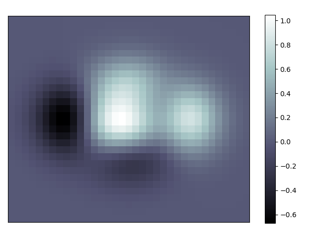
import numpy as npimport matplotlib.pyplot as pltdef f(x, y):return (1 - x / 2 + x ** 5 + y ** 3 ) * np.exp(-x ** 2 - y ** 2)n = 10x = np.linspace(-3, 3, 3.5 * n)y = np.linspace(-3, 3, 3.0 * n)X, Y = np.meshgrid(x, y)Z = f(X, Y)plt.axes([0.025, 0.025, 0.95, 0.95])plt.imshow(Z, interpolation='nearest', cmap='bone', origin='lower')plt.colorbar(shrink=.92)plt.xticks(())plt.yticks(())plt.show()
4.6 饼状图 Pie Charts
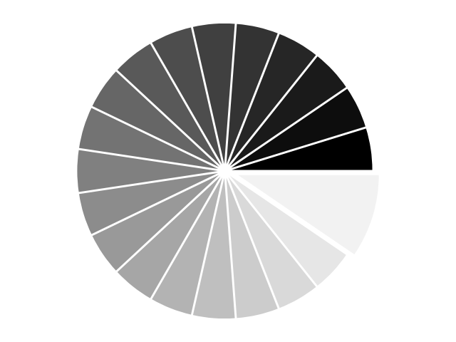
import numpy as npimport matplotlib.pyplot as pltn = 20Z = np.ones(n)Z[-1] *= 2plt.axes([0.025, 0.025, 0.95, 0.95])plt.pie(Z, explode=Z*.05, colors = ['%f' % (i/float(n)) for i in range(n)])plt.axis('equal')plt.xticks(())plt.yticks()plt.show()
4.7 场图 Quiver Plots
import numpy as npimport matplotlib.pyplot as pltn = 8X, Y = np.mgrid[0:n, 0:n]T = np.arctan2(Y - n / 2., X - n/2.)R = 10 + np.sqrt((Y - n / 2.0) ** 2 + (X - n / 2.0) ** 2)U, V = R * np.cos(T), R * np.sin(T)plt.axes([0.025, 0.025, 0.95, 0.95])plt.quiver(X, Y, U, V, R, alpha=.5)plt.quiver(X, Y, U, V, edgecolor='k', facecolor='None', linewidth=.5)plt.xlim(-1, n)plt.xticks(())plt.ylim(-1, n)plt.yticks(())plt.show()
4.8 网格 grids
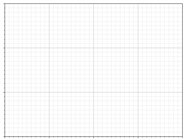
import matplotlib.pyplot as pltax = plt.axes([0.025, 0.025, 0.95, 0.95])ax.set_xlim(0,4)ax.set_ylim(0,3)ax.xaxis.set_major_locator(plt.MultipleLocator(1.0))ax.xaxis.set_minor_locator(plt.MultipleLocator(0.1))ax.yaxis.set_major_locator(plt.MultipleLocator(1.0))ax.yaxis.set_minor_locator(plt.MultipleLocator(0.1))ax.grid(which='major', axis='x', linewidth=0.75, linestyle='-', color='0.75')ax.grid(which='minor', axis='x', linewidth=0.25, linestyle='-', color='0.75')ax.grid(which='major', axis='y', linewidth=0.75, linestyle='-', color='0.75')ax.grid(which='minor', axis='y', linewidth=0.25, linestyle='-', color='0.75')ax.set_xticklabels([])ax.set_yticklabels([])plt.show()
4.9 多图 Multi Plots

import matplotlib.pyplot as pltfig = plt.figure()fig.subplots_adjust(bottom=0.025, left=0.025, top = 0.975, right=0.975)plt.subplot(2, 1, 1)plt.xticks(()), plt.yticks(())plt.subplot(2, 3, 4)plt.xticks(())plt.yticks(())plt.subplot(2, 3, 5)plt.xticks(())plt.yticks(())plt.subplot(2, 3, 6)plt.xticks(())plt.yticks(())plt.show()
4.10 极轴 Polar Axis
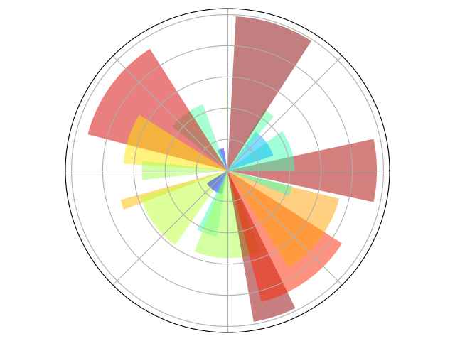
import numpy as npimport matplotlib.pyplot as pltax = plt.axes([0.025, 0.025, 0.95, 0.95], polar=True)N = 20theta = np.arange(0.0, 2 * np.pi, 2 * np.pi / N)radii = 10 * np.random.rand(N)width = np.pi / 4 * np.random.rand(N)bars = plt.bar(theta, radii, width=width, bottom=0.0)for r,bar in zip(radii, bars):bar.set_facecolor(plt.cm.jet(r/10.))bar.set_alpha(0.5)ax.set_xticklabels([])ax.set_yticklabels([])plt.show()
4.11 3D画图 3D Plots
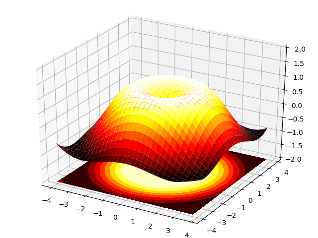
import numpy as npimport matplotlib.pyplot as pltfrom mpl_toolkits.mplot3d import Axes3Dfig = plt.figure()ax = Axes3D(fig)X = np.arange(-4, 4, 0.25)Y = np.arange(-4, 4, 0.25)X, Y = np.meshgrid(X, Y)R = np.sqrt(X ** 2 + Y ** 2)Z = np.sin(R)ax.plot_surface(X, Y, Z, rstride=1, cstride=1, cmap=plt.cm.hot)ax.contourf(X, Y, Z, zdir='z', offset=-2, cmap=plt.cm.hot)ax.set_zlim(-2, 2)plt.show()
4.12 文本 text
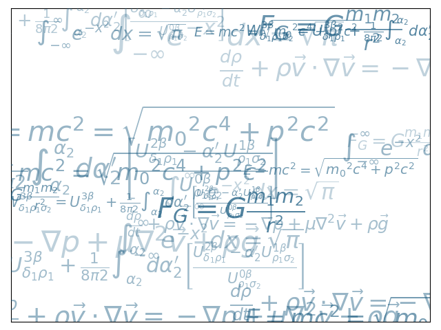
import numpy as npimport matplotlib.pyplot as plteqs = []eqs.append((r"$W^{3\beta}_{\delta_1 \rho_1 \sigma_2} = U^{3\beta}_{\delta_1 \rho_1} + \frac{1}{8 \pi 2} \int^{\alpha_2}_{\alpha_2} d \alpha^\prime_2 \left[\frac{ U^{2\beta}_{\delta_1 \rho_1} - \alpha^\prime_2U^{1\beta}_{\rho_1 \sigma_2} }{U^{0\beta}_{\rho_1 \sigma_2}}\right]$"))eqs.append((r"$\frac{d\rho}{d t} + \rho \vec{v}\cdot\nabla\vec{v} = -\nabla p + \mu\nabla^2 \vec{v} + \rho \vec{g}$"))eqs.append((r"$\int_{-\infty}^\infty e^{-x^2}dx=\sqrt{\pi}$"))eqs.append((r"$E = mc^2 = \sqrt{{m_0}^2c^4 + p^2c^2}$"))eqs.append((r"$F_G = G\frac{m_1m_2}{r^2}$"))plt.axes([0.025, 0.025, 0.95, 0.95])for i in range(24):index = np.random.randint(0, len(eqs))eq = eqs[index]size = np.random.uniform(12, 32)x,y = np.random.uniform(0, 1, 2)alpha = np.random.uniform(0.25, .75)plt.text(x, y, eq, ha='center', va='center', color="#11557c", alpha=alpha,transform=plt.gca().transAxes, fontsize=size, clip_on=True)plt.xticks(())plt.yticks(())plt.show()
5 本教程之外 Beyond this tutorial
5.1 其余教程
Pyplot tutorial
Artist tutorial
Image tutorial
Path Tutorial
Transformations Tutorial
Working with text
5.2 Matplotlib文档
5.3 代码文档
help(plt.XXX)
5.4 Galleries
Galleries 帮助您实现已有图形。
5.5 Mailing lists
Uesr mailing lists
developers mailing lists
6 快速参考
6.1 线条属性 Line Properties
| Property | Description | Appearance |
|---|---|---|
| alpha (or a) | 透明度 0-1 | |
| antialiased | True or False - 使用antialised渲染 | |
| color (or c) | matplotlib color arg | |
| linestyle (or ls) | see Line properties | |
| linewidth (or lw) | float, the line width in points | |
| solid_capstyle | Cap style for solid lines | |
| solid_joinstyle | Join style for solid lines | |
| dash_capstyle | Cap style for dashes | |
| dash_joinstyle | Join style for dashes | |
| marker | see Markers | |
| markeredgewidth (mew) | line width around the marker symbol | |
| markeredgecolor (mec) | edge color if a marker is used | |
| markerfacecolor (mfc) | face color if a marker is used | |
| markersize (ms) | size of the marker in points |
6.2 线条风格 Line Styles
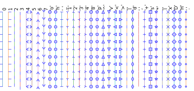
6.3 标记 Marks
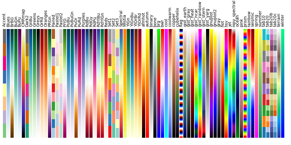
6.4 颜色表 ColorMaps
心血来潮,自娱自乐,供自己参考=.=
mr.yxj@foxmail.com
